It’s a digital world… we’re just living in it.
And right now, your chamber of commerce website is more important than ever. With hundreds of thousands of people changing the way they live and work due to the global pandemic, a digital online experience might be the only way you’re able to reach your members — so you’d better make it a good one.
With so many people turning online instead of stopping by in-person, it’s important for your chamber of commerce to remain an essential driving force in furthering community engagement.
But how do you continue to do that?
Think of your chamber’s website as your virtual first impression to keep your community members and potential donors coming back for more.
Whether you want to update your site or need a new website altogether, here are some of the things to keep in mind as you navigate the virtual world!
Check out these leading examples of chamber of commerce websites to get some inspiration for your own.
1. Make Your Site Easy to Navigate: Habersham Chamber of Commerce
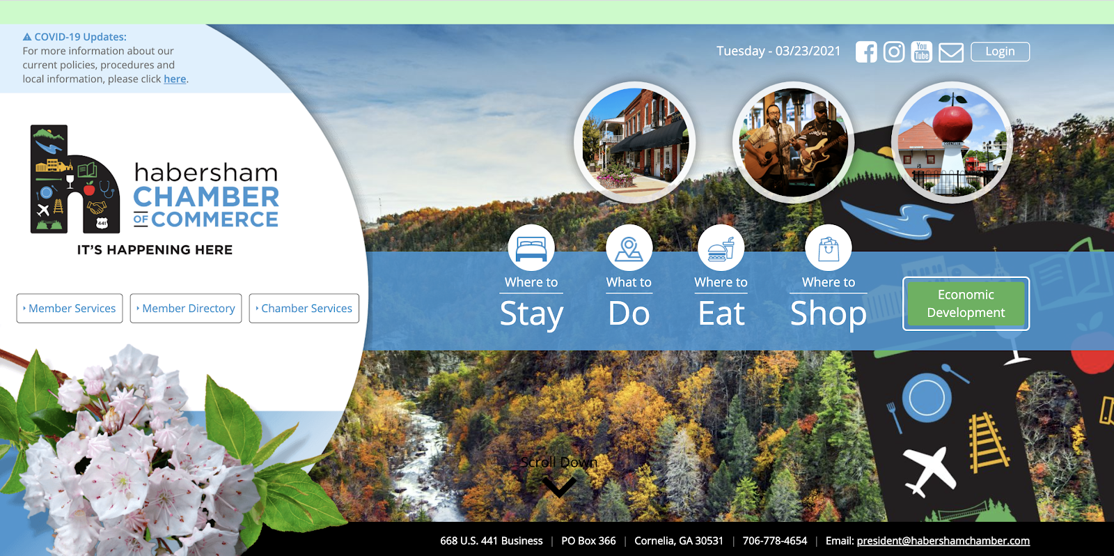
Chamber of Commerce websites serve more than just one purpose.
On one hand, they work to promote tourism and local businesses and organizations. On the other, they serve current members and garner funds in order to continue serving the public.
The Habersham Chamber of Commerce in Cornelia, Georgia has done an amazing job of using design to separate those two aspects of a Chamber of Commerce and making their site easy to navigate. Check it out!
2. Offer a Members Area: Key West Chamber of Commerce
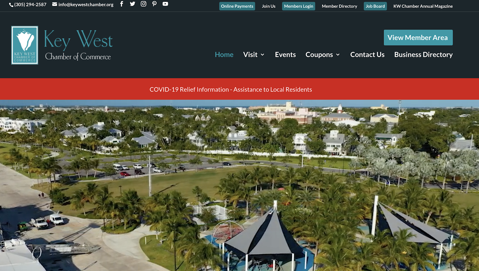
The Key West Chamber of Commerce site features a “Members Area” section. Why? It helps their members feel special and creates a deeper sense of connection. The Key West Chamber of Commerce “Members Area” section includes specific news and events that members might be interested in. This gives their members a special place to go and contributes to a sense of exclusivity.
Read More: Your Chamber Management Toolbox: 5 Musts
3. Use Photography to Showcase Your Town’s “Thing”: Arlington Chamber of Commerce
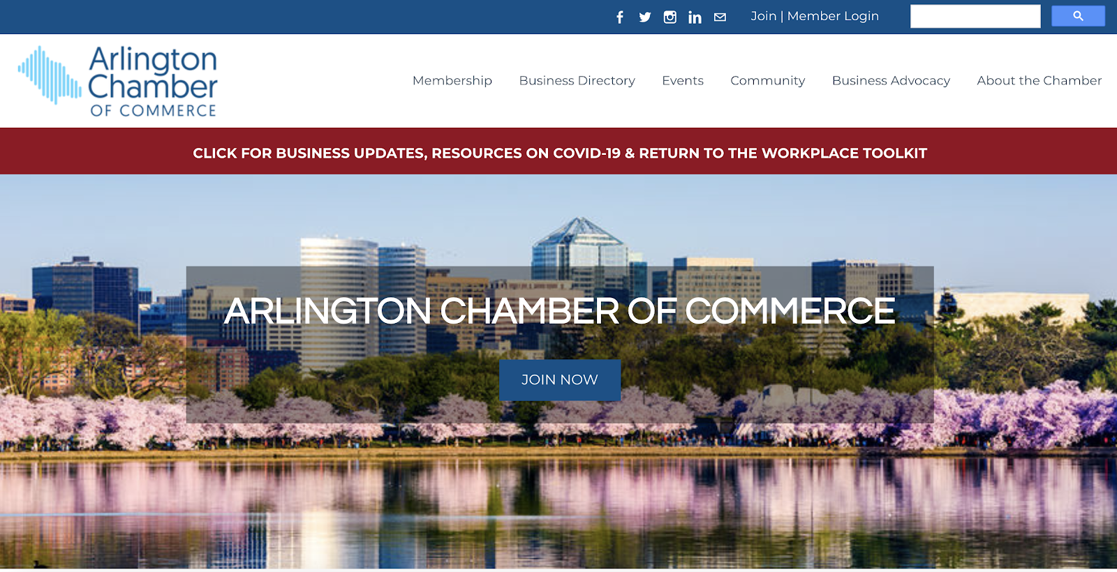
The Arlington Chamber of Commerce located in Arlington, Virginia has incorporated gorgeous photography to grab the attention of their audience from first click. Plus, they are showcasing what they’re known for — their gorgeous cherry blossoms!
4. Have a Mission or Slogan: Sonoma Chamber of Commerce
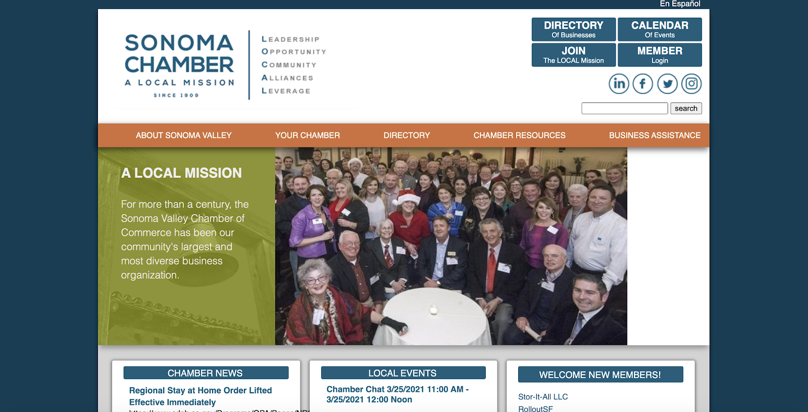
Your website visitors may be a mixture of those who know you and those who are hearing about you for the first time. Consider adding a mission statement that helps your audience understand what you’re all about, or that gives them more information.
For example, the Sonoma Chamber has a slogan of “A Local Mission.” LOCAL stands for “Leadership. Opportunity. Community. Alliances. Leverage.” Sharing it upfront makes it easy for new visitors to learn more about them, as well as reaffirming their values to existing members.
5. Make New Members Feel Welcomed: Fontana Chamber of Commerce
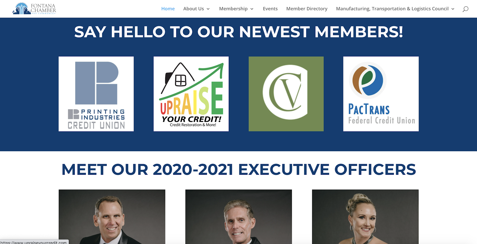
It’s the small touches that matter most, especially for member retention. Consider adding a spotlight to your website to highlight new or featured members like this Chamber of Commerce from Fontana, California.
Read More: Member Spotlights: 14 Questions to Ask
6. Use Video to Captivate Your Audience: Missoula Chamber of Commerce

Attention spans are short. What was I saying? Oh, right. Attention spans are short and long blocks of text may be the best piece of content you’ve ever written, but they still won’t get read. Instead, utilize the powerful aspect of video so that your audience can take in a visually appealing story. The Missoula Chamber of Commerce was able to interview people for one of their new initiatives, which is much more effective than simply quoting those involved.
7. Embrace Beautiful Design: Turlock Chamber of Commerce
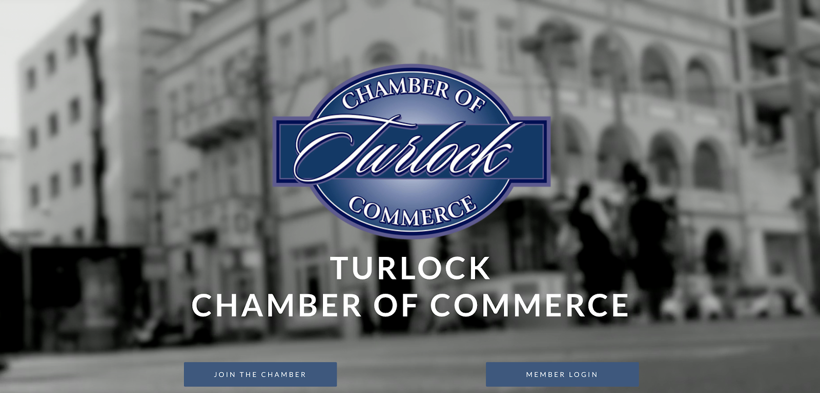
The Turlock Chamber of Commerce in Turlock, California offers beautiful video footage of a cityscape as soon as you click on the website. This Chamber or Commerce website goes to show that you can think outside of the box when it comes to design. This is the perfect example of a dynamic and engaging homepage.
8. Include A Way to Join on Every Page: Duluth Area Chamber of Commerce
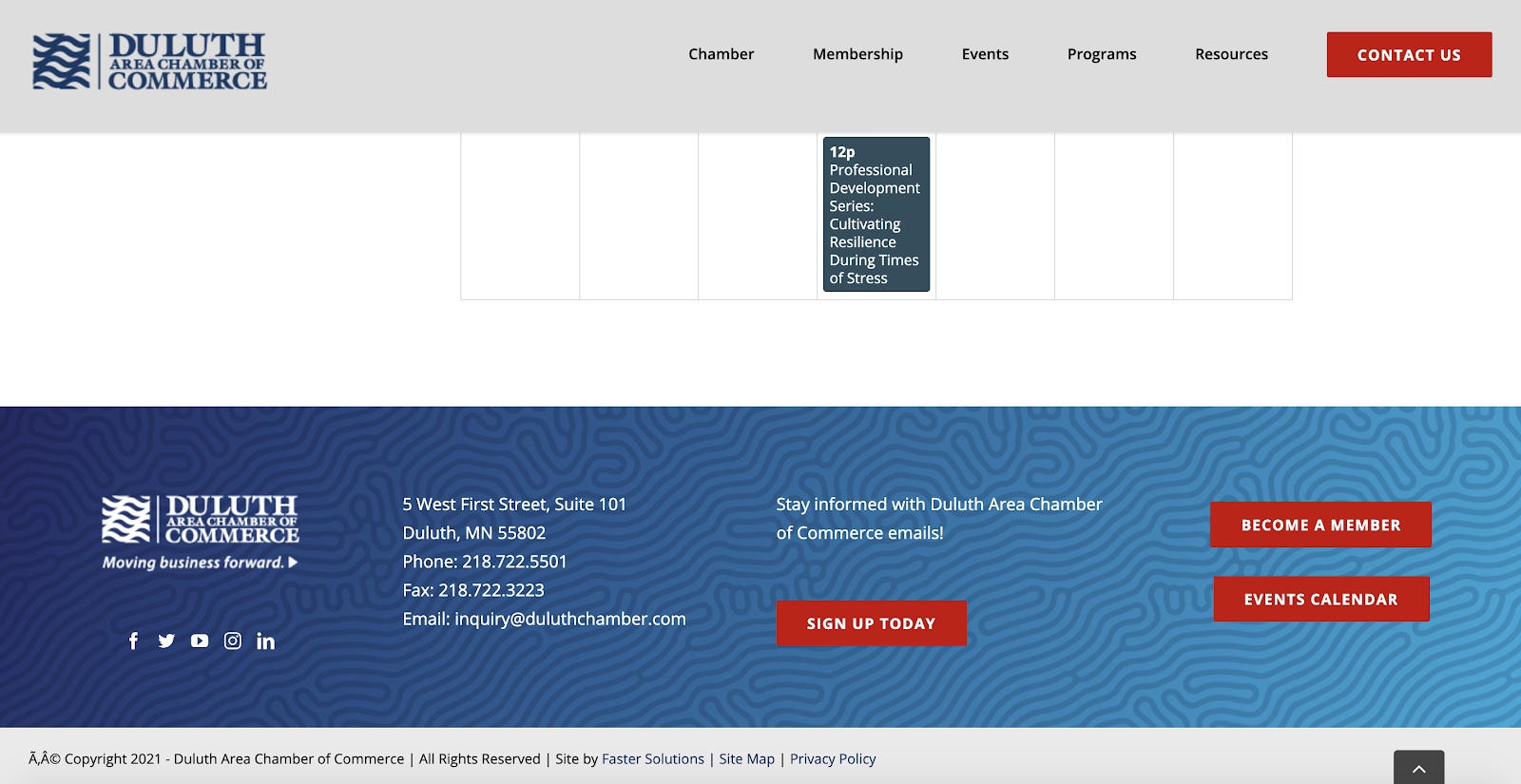
For a higher conversion rate, put the option to join your Chamber on every… single… page!
The Duluth Area Chamber of Commerce has cleverly added the option to “Become a Member” in their footer section so that the call to action isn’t left off of any page. You may also consider these edits to help grow your membership, including adding this call to action at the top of the page.
9. Use Testimonials from Current Members: Lincoln Chamber of Commerce
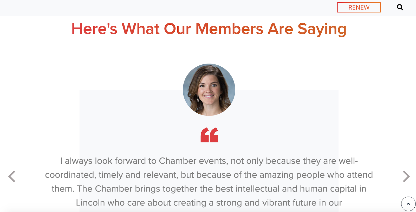
People trust people they know and recognize from your community. Consider adding testimonials from your current members or donors to your Chamber of Commerce website. This helps establish trust with people who may not know your organization yet.
10. Ask for Feedback: Florida Association of Chamber Professionals

In order to get better, you should be willing and open to receiving feedback. Take a lesson from the Florida Association of Chamber Professionals who have a “Contact Us” feature prominently in their top navigation. With one click, it opens an email directed toward the Chamber. That makes it easy and efficient for them to collect feedback! Or, consider taking it a step further and asking these eight survey questions of your members.
If there’s one thing that we know, it’s that most chambers are fed up with their software and websites. Maybe it’s time to love yours! Ask yourself if your chamber of commerce website is holding you back or moving you forward.
Each of the examples above of chamber of commerce websites are Memberclicks customers. From custom built websites to chamber of commerce website templates you can personalize, reach out today to learn how you can work with Memberclicks to love your site!


