As a trade association, you have more tasks to accomplish with your website than simply informing your audience.
Trade or business association websites are responsible for educating their members, as well as finding new members to help their cause. Considering the multiple purposes your site serves, designing the perfect website experience can be a bit trickier than it is for other businesses or organizations.
Plus, making a virtual first impression is more important now than ever. That’s why your website is one of the definite must-haves when it comes to managing your business association. As an added bonus, check out the other variables in this Association Management Toolkit, which has everything you need to succeed.
Wondering where your website comes in and why you should care? Let’s explore! These trade association website examples are doing it right. Check out what makes them successful below, and then let’s look into making sure yours is up to snuff.
1. Capture Visitor Information Fast to Grow Your Trade Association
Website for American Grassfed Trade Association
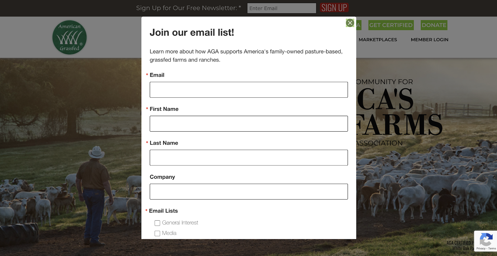
Keeping members or potential members in the know is vital to the success of your association, so ensure there are ways to capture email addresses early on. For example, American Grassfed has a popup to collect important info so they can stay in touch. Of course, site visitors can exit out of the pop up, and if they decide later on that they’d like to receive updates there is a section at the top of every page reminding their site visitors to get in on the newsletter action.

Why is this so vital? It’s your chance to continue showing up in your audience’s inbox to keep them coming back for more.
2. Easy Access to a Trade Association Membership Form
Community Development Center of Maryland’s Website

The Community Development Center of Maryland is doing it right by featuring a well-designed call-out box with a prominent button stating “Become a Member.” There’s no way to miss this call-to-action! Not to mention, the large photo behind the callout box helps draw the eye. Consider how much more meaningful this photo is versus a plain solid-color header — and remember that both your visuals and text contribute to attracting new members!
3. Have a Members’ Only Area for Association Members
Trade Association Website for Associated Industries of Texas

As we mentioned before, trade association websites serve different purposes. You’re equally trying to meet the needs of your current members to retain them, along with get new members or garner business for your current members.
The Associated Industries of Texas made sure to highlight their members section in red versus the blue for the rest of the navigation, ensuring it stands out. Plus, the color scheme goes perfectly with their logo for a design win. Consider how your trade or business association website can have a separate space for your members including news specific to members, events and ways to stay involved so that they can easily find the information they’re looking for.
4. Incorporate Your Trade Associations Brand’s Color Palette
Ohio Children’s Alliance Website
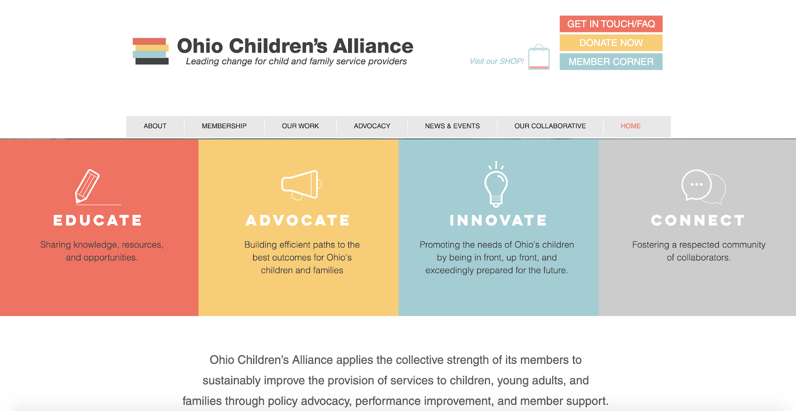
One of the biggest mistakes association websites make is focusing entirely on content and neglecting design. Instead, associations should create an engaging membership site by marrying the perfect content and design.
Take the Ohio Children’s Alliance, for example. Their logo has a stack of colors, which they then incorporate throughout the site. The result is an eye-catching, easy-to-navigate website design. The rectangle and square features stay consistent without, and they stack calls to action at the top and bottom of the page. This means users can easily and quickly navigate to the right area.
5. Ask for Feedback from Trade Association Members
Website for The Florida Trust for Historic Preservation

Nobody’s perfect, and even the best websites can improve. Ask for feedback often, including how you can improve your website. Every trade association is different, so there could be some items you’re missing that directly relate to what you do. The Florida Trust for Historic Preservation has a large footer at the bottom of their site that you can’t miss. They clearly tell their audience “WE WANT TO HEAR FROM YOU.”
6. Display Your Trade Association Membership Levels
Massachusetts Pharmacy Association Trade Website
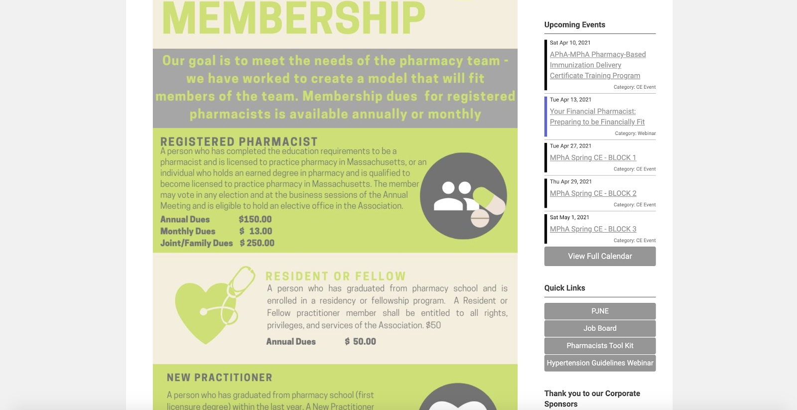
You wouldn’t expect a small business to be able to pay the same amount as a business with a huge operating budget to be a part of your association. In order to make your trade association website accessible, list the various membership options prominently like the Massachusetts Pharmacy Association.
This association knows that not all people belonging to their organization are the same, which is why they included a new pharmacist rate, a student rate and more. Make sure to clearly lay out what it takes to become a member, including dues, on your site.
7. Choose A Modern Trade Association Website Design
Home Builders Association of Greater Cincinnati
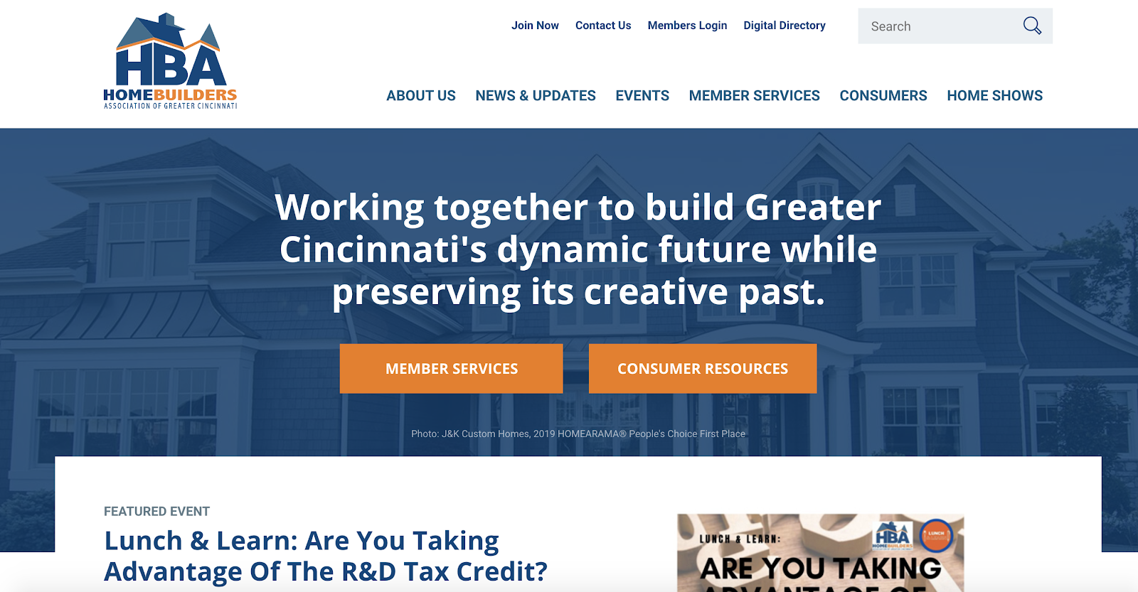
If your website looks like it hasn’t had a redesign since the dawn of the internet, it’s probably time for a redesign.
From the clever logo to modern design, Home Builders Association of Greater Cincinnati has adopted a modern and sleek design. While their content is also great, the design is what really helps draw the eye. They use orange as an accent color throughout, which ties to their logo. Plus, their bright buttons are clearly marked “Member Services” and “Consumer Resources.”
8. Make Your Trade Association Events Easy to Find
Dakota Credit Union Association

One of the pillars of an association is the education offered to members. The best way to get your audience involved is to spotlight upcoming events, either on the homepage or through a dedicated events page. The Dakota Credit Union Association has done a great job of calling out upcoming events on a section of the homepage, as well as a dedicated space on the top navigation.
9. Make Website Navigation Clear and Easy
Michigan Association of Ambulance Services Website

Did you know that you’re more likely to convert a member or achieve your mission if your audience can get where they need to go in three clicks or less? At the very least, your end-user has less of a chance of losing interest or becoming frustrated with the navigation.
The Michigan Association of Ambulance Services uses a straight forward top navigation coupled with three direct “Call to Action” boxes. The directive is simple and clear, making it easy to get around their site. That means less clicks and more members!
10. Tell a Compelling Story
Southeast Concrete Masonry Association Website
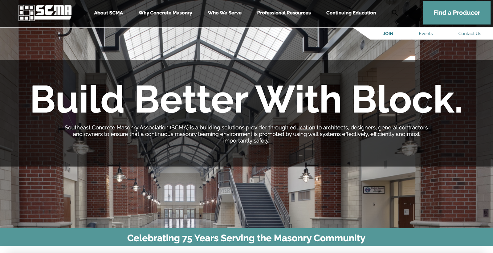
You’re only as good as your story… So how will you tell yours?
The Southeast Concrete Masonry site has a dedicated section called “Why Concrete Masonry” in addition to a prominent mission statement on their homepage. When you visit this site, you are fully immersed in what Southeast Concrete Masonry is about. Consider adding a dedicated section on your site as well as heavily focusing on how you tell your story to both attract new members and advocate for the importance of your trade.
11. Get Creative With Design
Website for Arizona Chapter of the Associated General Contractors of America
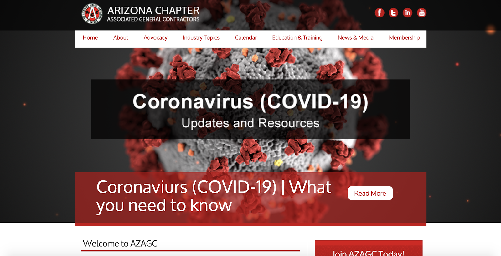
While many websites shy away from pushing the envelope with design, the Arizona Chapter of the Associated General Contractors of America has fully embraced a dramatic design. Instead of simply uploading a box to highlight their COVID-19 resources, they found an image that matched their color scheme to make the site much more appealing. Ask yourself where your association could think outside the box for design.
12. Include Accolades and Testimonials
Florida Senior Living Association Website

This is one area that many trade associations don’t remember to include on their website. If you have various accolades or awards, include them prominently on your site. This helps establish trust with your audience. While it may feel odd to sing your praises with your association website, it will undoubtedly provide credibility for those doing business with you, and to garner more members. Take note from the Florida Senior Living Association and be proud of your accolades.
Inspirational Association Websites
If you’re daydreaming about a site like this for your trade association, it’s totally within reach. All of these association website examples are MemberClicks customers. If you’re looking to step up your trade association website’s online presence, reach out today to learn how you can work with MemberClicks, too!


