You’re a professional in your own right at your craft, belonging to a whole group of like-minded professionals.
But what about when it comes to telling others about what you do, and keeping others engaged? We’re talking, of course, about your professional association website.
Your website is your virtual first impression. It’s both a chance to acquire new members and a retention tactic for your current members. That’s why as a professional association, optimizing your website is an absolute must-do.
(Want to know the other “musts”? Click here!)
Do you think your professional association website has what it takes to cater to all of your audiences and be successful?
If not, have no fear. You can get guidance from these top 10 professional association websites of 2021! Check them out below and see what they’re doing right that you can also implement.
Click here to download the complete Association Website Checklist.
1. Add Clear Call-to-Action Buttons: Independent Insurance Agents of Nebraska

Professional association websites serve multiple purposes, and you have the difficult task of catering to all your potential end users. First, there are the people who may be interested in joining your professional association. Next, you have current members who want their own personalized experience. Not to mention those who are looking to partner with your association for education, speaking engagements, or to find professionals in your industry for work.
So what are you to do? Well, you could follow the example of The Independent Insurance Agents of Nebraska. They have an easy-to-follow design with quick-link buttons to join, see the events calendar, find professional development, and the member news right underneath. Consider how your professional association website can easily call out the top reasons somebody might be looking at your site!
2. Use Attention-Grabbing Imagery/Branding: Electric Cities of Alabama
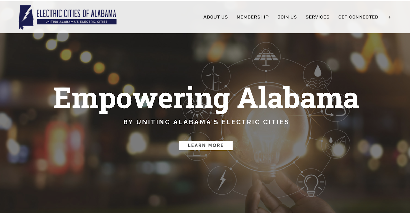
First impressions are everything, and the Electric Cities of Alabama used what they do best and married it with attention-grabbing design. What your association stands for will be why somebody stays, but first you have to capture their attention. By combining an image and graphic design that catches the eye, they’re able to easily captivate their website audience.
Think about how you can use captivating imagery, such as a text overlay on a darkened image like seen above. Use the branding or imagery to guide your users to do what you’re like them to do (for example above, Learn More!).
3. Highlight Your Membership Perks: International Transplant Nurses Society
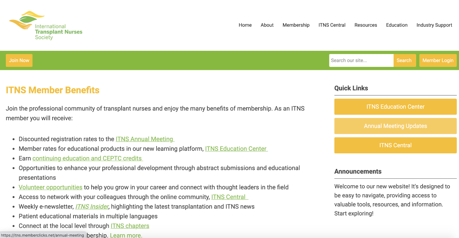
Your website is in the business of selling. Communicate your value from the virtual rooftops, both early and often. Tell your potential members why it’s so great to be a member. The International Transplant Nurses Society has an entire page dedicated to why you might want to be a member.
Some typical perks might include exclusive education, networking opportunities, credits or certifications and so much more. So think about it — what does your professional association have to offer? Shout it from your own virtual rooftop… your website!
4. Include Easy Navigation: National Society of Black CPAs
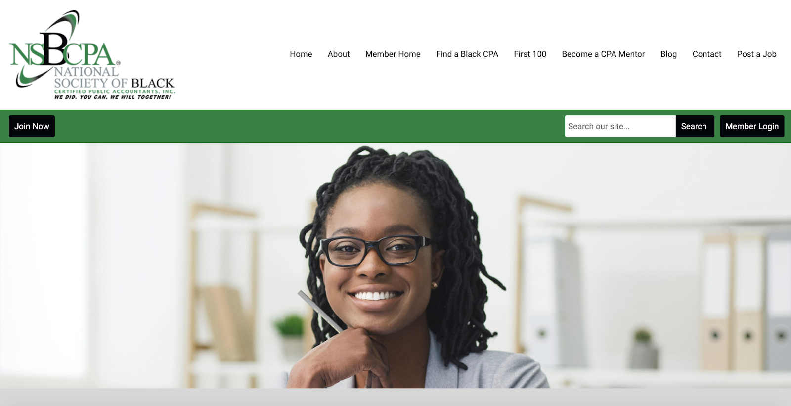
The National Society of Black CPAs has done their due diligence to make their navigation easy to follow. You’ll see “Join Now” on one side and the “Member Login” on the other. There’s even a search in the top between the two areas. With those three simple elements, the National Society of Black CPAs has easily directed both members and prospective members. As an added bonus, the top navigation offers a space to find a Black CPA so that their members can get more business!
5. Have Events for Members & Non-Members: International Association of Canine Professionals
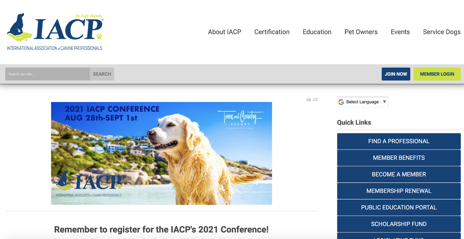
Events, virtual or in person, are one of the staple reasons to join a professional association. Make sure to have a dedicated space to talk about your upcoming learning opportunities. Normally, one of the perks of joining a professional association is to attend the events for a discounted or free rate.
But that doesn’t mean you’ll want to exclude non-members from your events. Why? It’s the perfect opportunity for them to see what you’re all about! The International Association of Canine Professionals has two registration buttons on events: one for members and one for non-members.
6. Tout Your Credibility: DevOps Institute

Building credibility for your professional association is an important aspect of professional association websites in order to attract new members.
Take the DevOps institute for example. On their homepage, they’ve expertly featured that their network contains more than 60,000 DevOps practitioners and thought leaders, who hold more than 25,000 certifications, come from 160+ countries, and also includes 150+ education partners. Think about how your professional organization website can list information that might provide credibility for others who are considering joining.
7. House Your Member News: Ohio Cattlemen’s Association
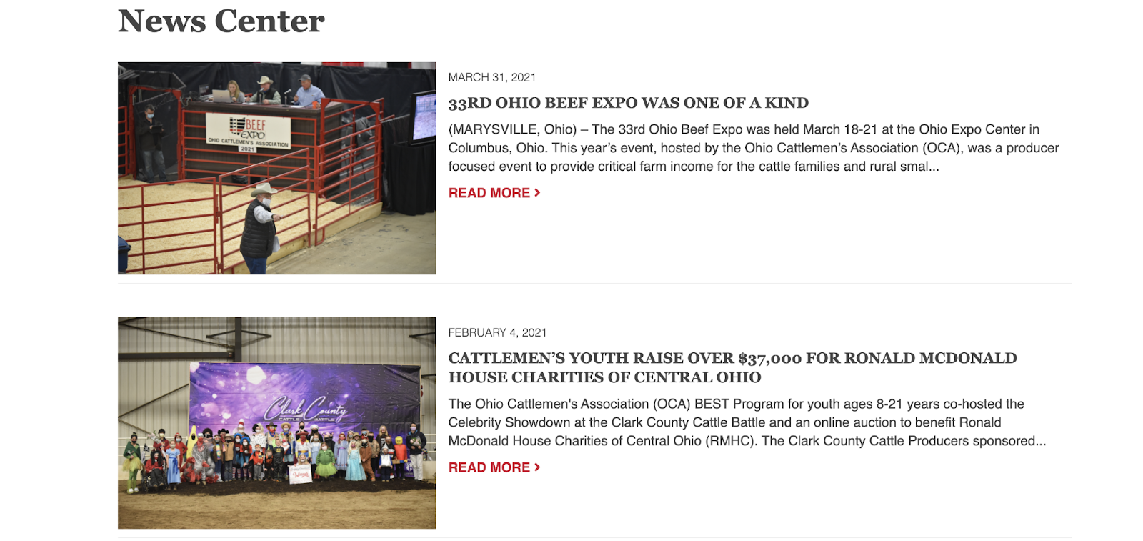
One important aspect of professional association websites is to make your members feel special. You want them to find the value in what you’re doing, as well as feel seen and heard. The Ohio Cattleman’s Association does a great job of both building credibility and making their members feel special by housing an entire area for news. If your professional association has members who might have news articles, consider housing a place to celebrate your members.
8. Add Quick Links on the Member Landing Page: Texas PRIMA
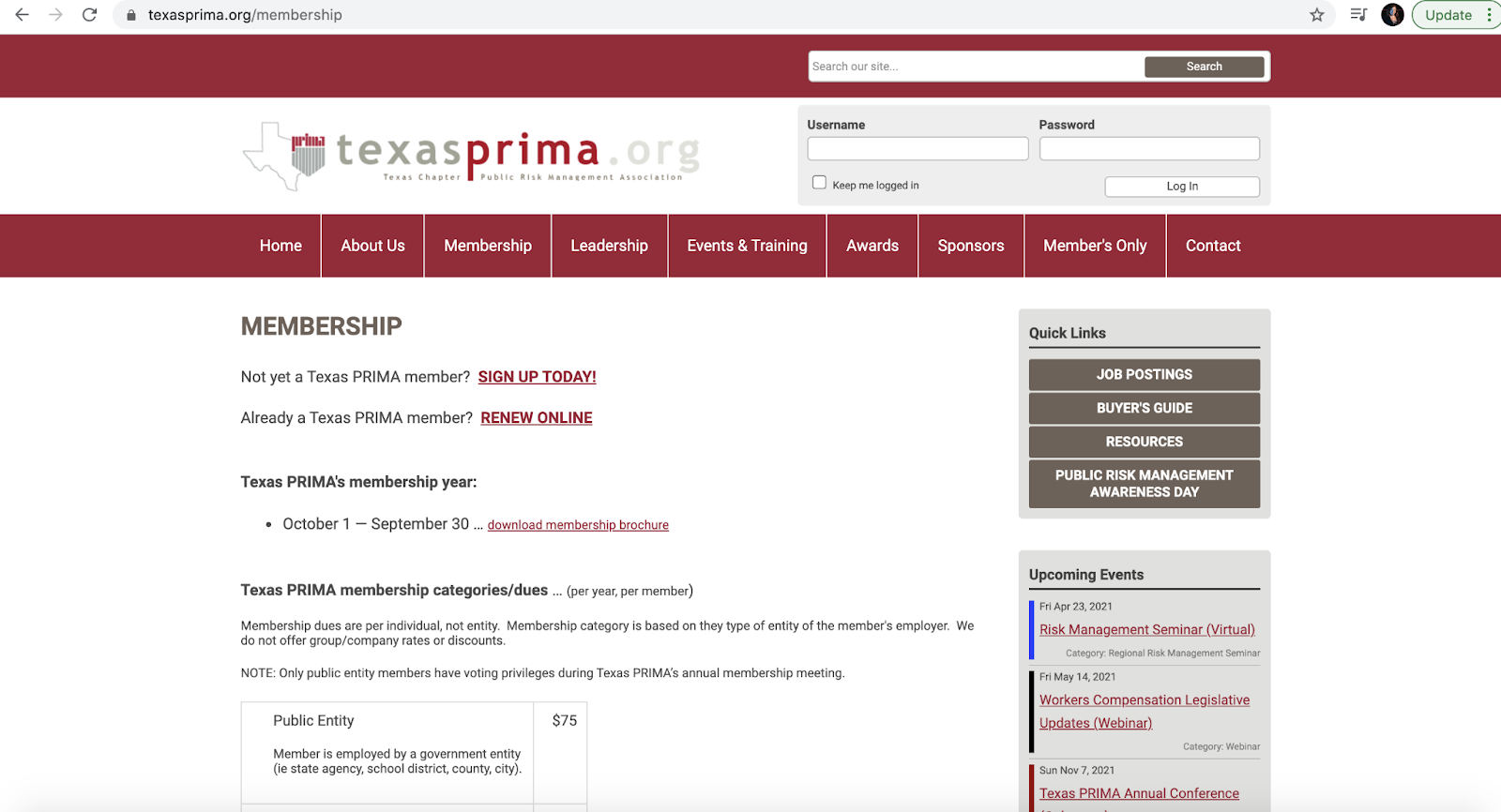
As discussed in our complete membership web guide, quick links on the member landing page are a must. That’s because you want to give your audience the easiest, quickest path to find what they’re looking for. Some common options for the quick links could be a place to join your association, a members only login, educational resources and more. The links will truly depend on the content available for your association.
9. Make It Easy to Contact Your Association: Construction Leadership Network
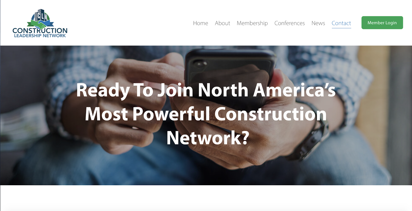
Making your professional association easily accessible is key! Always highlight ways that your website visitors can get in touch by including an email, phone number, address, and/or contact form. The Construction Leadership Network includes a page that follows the end-user around because it’s in the top navigation. Consider doing the same for your professional association!
10. Talk About Issues Important to Your Association: Rural Health Association of Tennessee
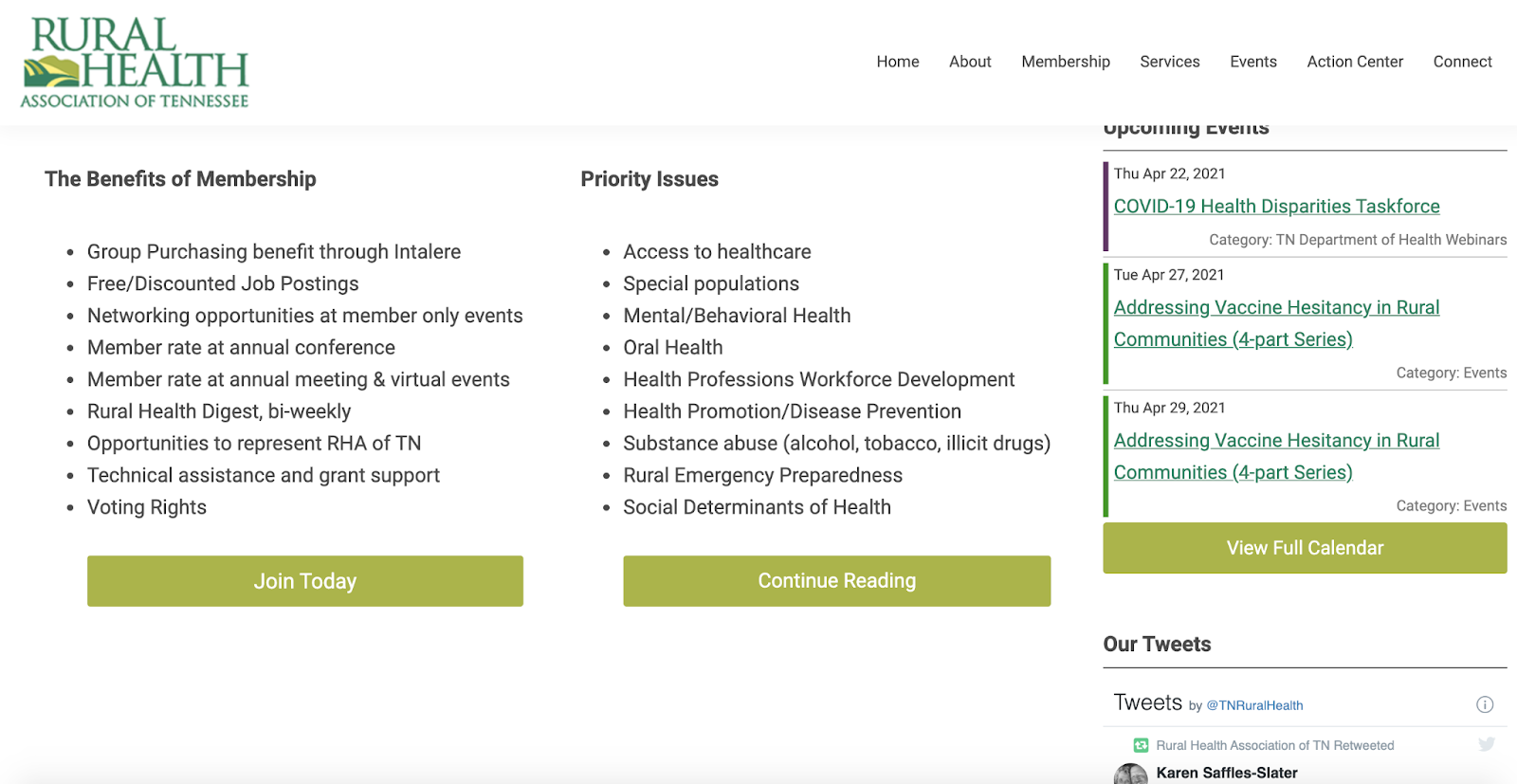
The Rural Health Association of Tennessee has an entire section right next to their member benefits on the homepage that discusses the issues important to their members. This is a quick and easy way for potential members to spot similarities in issues that may be important to them. Not only did they highlight the membership perks, but they also documented the issues that current members are dedicated to solving.
These professional association websites are doing it right! Now it’s time to put these tactics into action. Did you know that all of the websites above are MemberClicks customers?
Reach out today to learn how you can work with MemberClicks, too. It’s time for a professional association website that gives your current members, potential members and partners everything they need in one place.