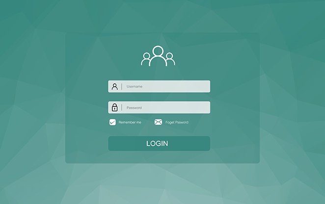
Getting your members to login can be challenging, but once they do, are you doing everything in your power to keep them there – happy and engaged? Are you providing them with the information they need to take “next steps” – whether that’s to register for your next event, renew their membership/pay dues, or even just read up on the latest industry news?
Having an engaging member landing page – the page members see upon logging into your site – dictates not only how much people engage with you, but whether or not they continue that behavior. (One or two bad experiences and someone could decide that logging in just isn’t worth it anymore.)
So what makes an engaging member landing page? What elements do you need? We’ve identified five must-haves:
1. Member name and involvement
This one seems obvious, but you’d be surprised at how many associations don’t personalize their member landing page. Or if they do, it’s the member’s name tucked away in a corner somewhere – barely recognizable.
Not very inviting, right? Make your members feel special and welcome by placing their name prominently on the member landing page. And not only that, but what company they work for and how they’re involved with your organization (whether or not they’re on a committee, on the board, etc.) as well. This warm welcome lets your members know they’re in the right place and that everything on this page was designed for them. (All the more reason for them to engage with it!)
2. Quick link to the member profile
When a member logs in, they should be able to easily access their member profile. From that profile, they should then be able to…
- Update their personal and professional information – This is where members can update their job title, company name, home address, telephone number, etc., which is crucial for your organization because in order to effectively engage with your members, you need that up-to-date contact info. (You can’t send them your quarterly publication if you don’t have their current home address!) This is also where you can encourage your members to upload a personal or professional headshot, which will show up in the membership directory. (Good for peer-to-peer engagement!)
- Access open and paid invoices – You want your members to pay their invoices, right? Of course you do! You wouldn’t go through the trouble of creating those/sending those out if you didn’t. That said, those invoices need to be easy to access and pay, which is why it’s important to link them somewhere on the member profile.
- View message history – Messages are a form of engagement. They’re how your members can communicate with your staff, as well as other members. That said, you want those messages to be easily accessible, and again, that’s why it’s important to house them on the member profile.
- View form submissions – Like messages, form submissions are also a method of engagement. Form submissions can be for a number of things: event registrations, committee applications, volunteer sign-ups, etc. You want those housed on the member profile as well so that members can easily see what forms they’ve submitted and when.
Now as you can see, all of these features are important – the ability to update member information, the ability to view/pay invoices, the ability to message staff and members, etc. So in order to get your members to actually participate in those activities, you need to make the member profile easy to access, and that means including a link to it on the member landing page.
3. Membership directory
If your membership directory is behind a firewall (in other words, reserved for members only), you should definitely include a link to it on your member landing page. This is a benefit for your members, so you want it to be easily accessible so that your members can not only interact with your association, but with other members as well.
4. Community access
Speaking of interacting with others, you absolutely want to have a community component on your member landing page – links to social circles, online forums, peer-to-peer messages, etc. The more friends/connections a member has within your organization, the more likely they are to actually stay with your organization – so you want to promote that relationship-building behavior by making that process easy.
5. Personalized content
We talked a little bit about the importance of personalized content on your member landing page – the member’s name, involvement, etc. But ideally, you should be taking it a step further by providing personalized content BASED on that involvement. For example, if one of your members is on the board, show them information about their next board meeting. Or, if one of your members is on a committee, show them information related to that committee. The more personalized the content, the more likely your members are to actually engage with it.
Now this is really just brushing the surface on what makes an engaging member landing page. Ideally, you should have more than just the items listed here. To see a full list of elements your member landing page NEEDS, check out our free guide below!


